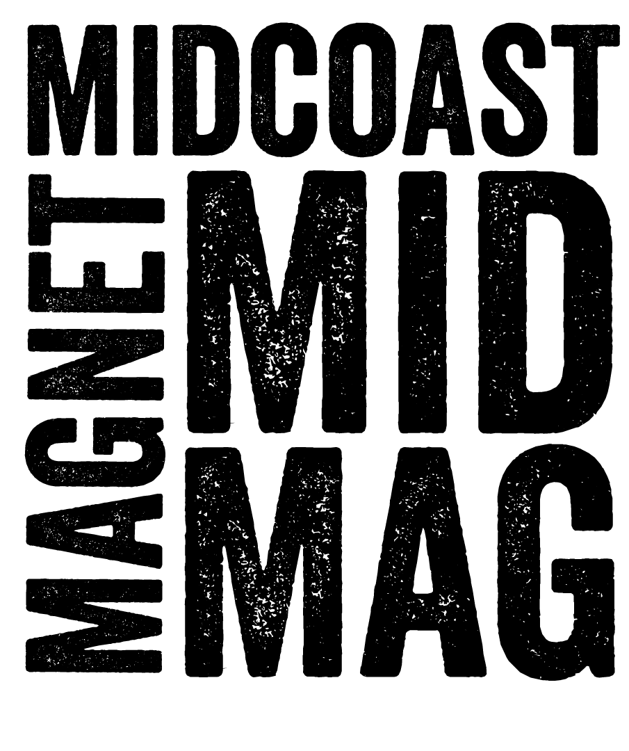
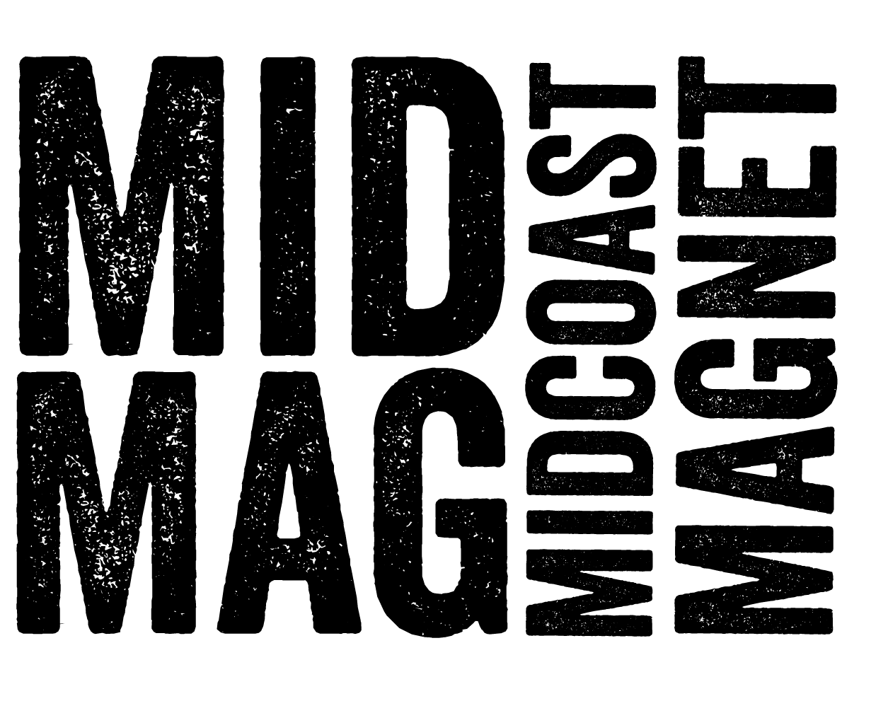
After 10 years with an outdated and confusing logo, Midcoast Magnet had graduated to needing a logo that diplayed confidence and comanded the repect a successful 12 year old nonprofit has earned. The organization had long been known as Mid Mag within the organization, and, as a well known local organization, we felt a version of the logo should reflect this term of endearment.

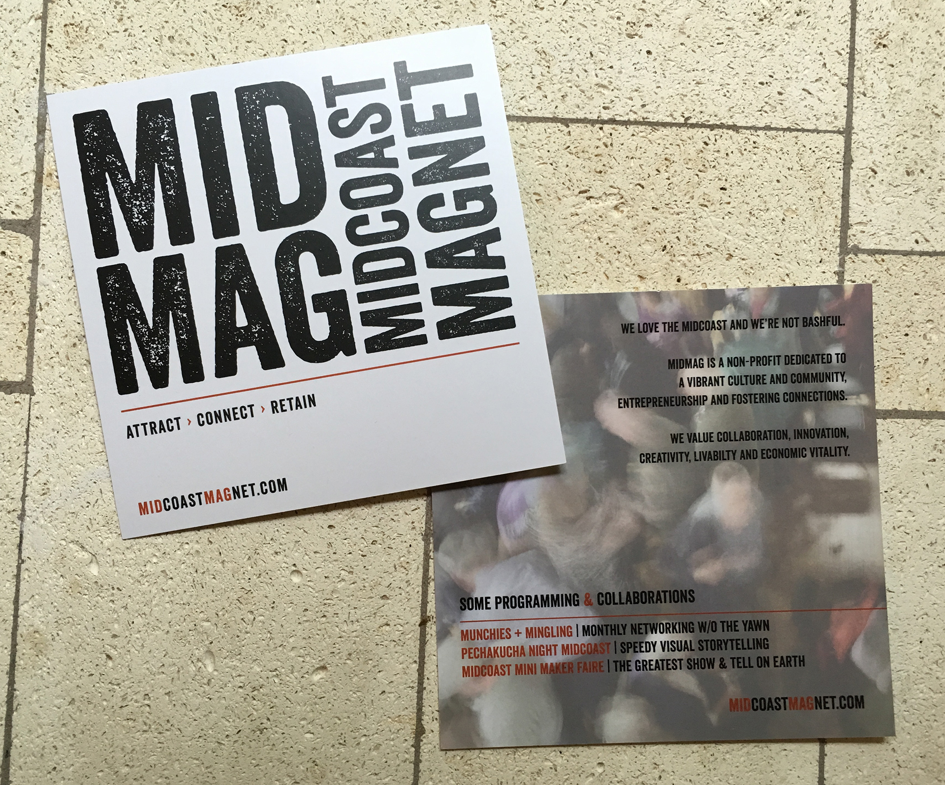
After 12 years of having no collateral, a small square piece was developed as a general handout at events. Space was left open to add relevant upcoming information as needed.